piątek, 20 grudnia 2013

The appearance panel

I had the opportunity to have a closer look to the appearance panel while I was doing my digital skills exercises last semester. I used it then to stylize some text.
Thanks to the "Veerle Duoh" tutorials I had a chance to rediscover the numerous possibilities that the appearance panel give.Using the appearance panel we are able to create some spectacular images by simply changing the colors and transparency of the strokes.
In a very quick, few steps that I followed to do some exercise I managed to create interesting pictures with only one path.


The appearance panel shows different attributes of a path or object. Fills and strokes applied to a path can create interesting shapes.With just a simple path we can easily create some really interesting compositions. 

By stacking multiple white and black strokes of different weight on the top of  another I managed to create the look of a railway. 


On the same way - using black and white strokes of different weight and applying a dash option -I managed to create the look of a road. 


Even though the picture below seems to look far more elaborated it was created on exactly the same way that the previous ones- with one path. This time I was experimenting with different colors, patterns, blending modes and with the transparency options. 


wtorek, 17 grudnia 2013

Packiging net.


Today in the college we were introduced to the idea of building a packaging net. We were presented with different sorts of packaging nets and were shown how to make a net using AI.  
Thanks to some help from my tutor I was able to build a net for the box that I designed for the BOX brief.


Evaluation:
The ability to build the net helped me to speed up my workflow. I didn`t have to rely on any outside sources. Creating a net gave me the possibility to manufacture a prototype of my packaging. 
The net helped me a lot in creating the layout of my design- it made the job much easier. Thanks to it I would be able to put the elements of my design on a 2d surface. This way of presentation will gave me the chance to get across my ideas easily.

As a prospective graphic designer I would probably come across packaging design briefs. The knowledge and ability to build a packaging net (and then packaging prototypes) would contribute to the quality of customer presentation.
Experience in using CAD is one of the basics requirements that are stated in numerous job offers.


czwartek, 12 grudnia 2013

http://veerle.duoh.com/

Among numerous graphic design blogs that I found on the Internet the "Veerle`s blog" ( http://veerle.duoh.com//) attracted my special attention. Not only was the appealing and eye-catching graphic and layout of the website worth a second look but also interesting and useful tutorials that was posted on this website.


Creating a color palette.

For one of the on-line tutorials that I have been doing recently I needed a specific color palette which would consist of  36 color swatches going from bright yellow, to orange, red, purple, blue, green. This gave me a chance to learn how to create a new color pattern in the swatches panel. Because I`ve never done this before I started looking up on the Internet to find a tutorial on how to build up a new color pattern.
I came across this you tube film http://www.youtube.com/watch?v=cSnR9l897t8, which explains step by step how to save a new color group in the swatches panel in the Illustrator.

I wanted the transition between the colors to be as smooth and delicate as possible, that`s why I was trying to blend colors of similar shade.
I started from drawing two objects and filling them with two colors: bright yellow and red. I selected the two objects and went to Object- Blend- Make. This option allows to make a smooth transition between objects as well as create a blends of colors.


By going to the blend options you can establish the amount of steps that the transition will make.

I was blending different colors to the point when I got the amount of shades that I wanted.


When I was satisfied with the color transition I went to the swatches panel it the upper right corner of the swatches window and opened "New color group" in the fly-out menu. I named the new color group that I was about to create. 


A new folder opened in the swatches window. I selected the eyedropper and clicked on the first square the color of the square appeared as the fill color. I went to the fill icon and simply drag it across to the new color group folder. Step by step I created the color palette that I wanted. 

I found this new skill very useful and handy. Creating new color palette certainly can add to the creativity and speed up the work flow as well. 


środa, 11 grudnia 2013

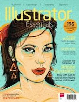
Illustrator Essentials Magazine

A couple of months ago I came across the Illustrator Essential Magazine which turned out to be a very rich  source of useful advice on how to get started and improve skills in Adobe Illustrator.


The magazine contains nearly 30 step-by-step tutorials and loads of tips for all levels of illustrator users. Apart from that it offers an access to 14 video lessons. 
I have been practicing with the magazine since then. It helped me to understand better some of the Illustrator features and learn new skills which helped me to speed up my work flow. 

wtorek, 10 grudnia 2013

Packaging Design- developing an initial idea.


My next step of designing the packaging for the Box company was developing my chosen initial idea. I started from looking for some inspiration on the INTERNET. I aimed to design a straightforward and down-to-earth box. I wanted my design to be catchy and witty. 
I was looking for some funny and catchy phrases about men`s underwear, and I came across some jokes on the INTERNET. 
This is one example:

Under Where? You: Hey, what are you doing under there? Your helpless victim: …under where? You: YOU SAID UNDERWEAR!


wtorek, 3 grudnia 2013

Packaging Design- initial ideas


Today I started drawing my initial ideas for the packaging brief. I was experimenting with different sorts of shapes of packaging to find one that is going to suit the brief best.
Eventually I decided to go for a simple, traditional box shape that opens up from a top. My idea is to decorate the box with a bold design. Keeping the form of the box simple will allow me to build a good balance between the construction of the packaging and the design on the box.  

czwartek, 21 listopada 2013

Analyzing job and personal specifications.


Recently I`ve been searching through graphic design job offers which are available on numerous recruitment websites. I`ve been trying to understand what requirements are most commonly specified in this adverts and think about my own skills and abilities which could suit them. 
Analyzing a graphic designer`s  job offers I realized that a great impact is put on communication skills. Apart from obvious requirements  like ability to think creatively and relevant knowledge on appropriate level,  skills like ability to manage own workload and work within set time parameters, lateral thinking or the ability to work collaboratively are essential.
Because I didn`t give enough thought to this part of job specification before, this time  I decided to focus on the ones which concern team work, communication and management skills.
In my research I focused on job offers for  junior and freelance graphic designers- the ones I could be interested in.  The job specifications vary depending on  the character of the job, but analyzing a few of them I was able to find a common ground for all of them.
I separated the requirements into four parts- experience, knowledge, collaborative skills and skills and attributes which influence the individual work.

Experience.
Nowadays relevant experience is vital in nearly every job. It is no different in graphic designer world. Some of the job offers cites a very specific requirements concerning experience- which is often of 2-3 years whereas other job offers mention just the field of experience which is required, but not the exact time span i.e. experience in using CMS systems
I have no working experience in graphic design industry but I could get an experience in some specific area of graphic design through college or work placement.

Knowledge.
Depending on a company the requirements concerning the level of knowledge can vary. I noticed that the most wanted is print production and the relevant computer programs knowledge. Some of the job specifications mention school degree, but that  is just minority of them.
I think my college is going to help me to get knowledge on appropriate level. I`m going to have to expand it though home study as well (i.e. through on-line tutorials etc) The internet is a great source of information on graphic design. On this stage of my study I don`t think my level of knowledge would meet the requirements specified by employers.

 Collaborative skills.
A great impact is put on communication skills. This helps in team work as well as dealing with a client directly. The ability to present ideas or creative concept is important too.
I think I am a person who enjoys  team working which I could tell from my previous job experience. I am not a leader type, that is why I`m not able to manage people in their work.   

Skills and attributes which influence the individual work.
All the job offers I have seen emphasize the importance of the ability to manage your own workload, great  attention to details, excellent time management skills, self-motivation and enthusiasm.
Over the last 2 years in college I`ve been learning how to manage a project and organize my own work. Despite of this experience I think that there is still a big scope for improvement. Last year`s ppd task concerning time management skills made me aware of the techniques to learn it. I`m still learning how to manage my time. I`m going to take a closer look to my time management skills  and try to improve it.
Unfortunately I am not a person who pays attention to details. Being aware of this and knowing that this a precious attribute of graphic designer  I try to focus more on details.


Summary:


The typical work activities for graphic designers include:

-meeting clients to establish the business objectives and requirements of the job
-interpreting business needs and coming up with a concept to suit their  purpose
-estimating time frame for the project
-developing design brief
-thinking creatively to produce an idea or concept
-presenting finalized ideas to the clients
-working as a part of a team with printers, copywriters, photographers etc.

To perform well in the industry graphic designer has to meet requirements listed in job specifications. The most commonly mentioned specifications are:

excellent communication skills
ability to sell/present an idea/creative concept
ability to deal with client directly
great attention to details
ability to manage own workload


poniedziałek, 18 listopada 2013

Packaging Design Brief- Task one


Today in the college we were introduced to the Packaging design module which  consists of two parts. The first task is to research a range of packaging  in order to understand the importance of good effective packaging design.
This task is going to cover the next two weeks.

My goal for the next 2 weeks is to gather visual examples of a range of packaging annotate them and evaluate the main aspects of effective packaging.
I will aim in researching a variety of packaging design and look at them from different angles to find examples which cover the feature of a good packaging.  

piątek, 15 listopada 2013

Employability skills.


Employability refers to a person's capability for gaining and maintaining employment.
Employability depends on various factors like: your knowledge, skills and attitudes, how you use this assets and how you present them to employers.
Job specification along with good technical understanding and subject knowledge often outline a set of individual skills that are required from an employees. The skills are supposed to equip the employees to carry out the role at the best of their ability.
Searching through the internet I came across a list of 10employability skills, created by a range of UK- based companies,  which are most frequently cited in job specifications. The list provided with short description explaining what the skills mean.
Analyzing the list I was trying to assess my employability skills.
11. Communication and interpersonal skills.
What that means?
It is the ability to express your thoughts in a clear way through written and spoken means. To listen and relate to other people.

As a member of waiting staff I strongly relay on communication and interpersonal skills at my current work. My job requires constant communication with my supervisor and my co-workers as well as with customers.

22.    Problem solving.
Is the ability to establish problem by identifying the key issues. Analyzing it by breaking it down into smaller parts and find a solution.

The problem solving ability is practiced by me in my work on the college`s projects. I start from identifying and researching the problem to find a solution. Then I try to map out the way to execute the project  by preparing an action plan.

33.  Using your initiative and being self motivated.
Having new ideas and not waiting to be told to do things.

Knowing well the nature of my job I am able to make my own decisions and take actions. I am comfortable to  decide about my actions at work. I tend to be active and I feel strong personal drive to not to wait to be told to do things.

44.     Working under pressure and to deadlines.
Be able to handle the stress which comes with deadlines.

I do my best to plan my work out , which helps me to give enough time to complete a task.
Unfortunately I am not good at sticking to my plan- this poses problems and causing stress.

55.       Organizational skills.
Being organized. Being able to plan work and monitor progress.

Despite paying more attention to plan my work I still often fail to keep to my plan, the reason for that is lack of self- discipline in monitoring my progress.

66.       Team working.
To work well with other people from different disciplines, backgrounds and expertise to accomplish a task.

Team work is essential in my current job. I often work with people from different departments . I really enjoy team work and I find myself as an valuable member of my team.

77.       Ability to learn and adapt.
To be able to learn from own mistakes .

I think I have the ability to learn from my own mistakes. I always read and analyze the feedback from my tutors. I always try to use the advice in my next work.

88.       Numeracy
The ability to use data and mathematics to support evidence or support a point.

Writing my dissertation when I was at the University I had to analyze graphs and tables to find the information needed.

99.       Valuing diversity and difference.
Being aware what the diversity can bring. Being able to recognize different values. Understand and being considerate of different needs of different individuals.

Working with different people I have noticed that every individual bring some different values to the team. Different people have different levels of knowledge and ability- recognizing individual needs and abilities is important for team work.

110.   Negotiation skills.
Being able to express your own requirements in an unemotional, clear way taking into consideration people`s feelings.

In most situation I feel comfortable to express my requirements.


wtorek, 12 listopada 2013

Instant Print final design.


For the past few days I was experimenting with the PS to create an asphalt texture that would be a background for the business card that I want to design. With some help of on-line tutorials I managed to create an image of uneven surface, that resembles the texture of a road.

I used different PS filters added the white and yellow broken line to the side and a marks of a tire that I made in adobe illustrator. The most difficult task for me, as always was to choose an appropriate typeface.


And this is the final design that I created for the Instant Print brief. I think it would work well for the company purpose, it is a simple, not very sophisticate, down-to-earth design. In my opinion it would be appropriate   for a variety of Travel and Transport businesses, because of the obvious association with the road.
I think the composition is quite static and well organized. Vertical lines reinforce this impression. The only accent that add a bit of a dynamism to the design is the tire mark that is put at an angle.  The composition doesn`t distract attention from the information that is going to be put on the business card.
The design is universal and would work for business cards and leaflets.

poniedziałek, 11 listopada 2013

Interview skills.


At the end of my college education I started thinking about the steps that I`m going to take in a search for another job. Preparing a CV is obviously the first step. When the application is successful we have to think about how to perform at the job interview. 
Without doubts job interview is a stressful experience for every job seeker. It is a meeting of an employer and a potential employee during which a potential employee is evaluated for prospective employment. The main purpose of a job interview is to determine whether or not the applicant is suitable for work. This decision has to be made in a very short time – during the interview. This is the only chance the applicant has to persuade the employer that he  is  the right candidate for employment.  To fully use this chance the potential employee should be well prepared for the job interview.
There are some general tips to increase the chance to succeed in interview.
Before the interview you should find out some information about the interview itself.
Where it will be held? What will be the form of the interview?
The information should be provided by the interview invitation, if not it is possible to call the organization and ask for it.
On the day of an interview  you have to make sure that he has all the papers required. You should have a copy of the invitation and your CV. A good idea is to take a notes with the bullet points of the question you want to ask. 
You have to bear in mind that the first impression is very important a job interview. It can make a big difference as the first judgment makes by the interviewer  is going to be based on how you look.
Decide about your outfit in advance. The outfit should be appropriate to the position you are going to apply for. The main thing is to look presentable, the outfit should be neat.
Before the interview you should think what could you say about yourself  which is relevant to the job.
The job specification can be used as a guidance for you to talk about your skills, work experience, qualifications and personality. Because there are probably many people applying for the same position you should think what could distinguish you from others.
Knowledge about  the job on offer and the employees profile let you stay on track while talking about yourself. Everything you say about yourself should be relevant to the job.
During the preparation for a job interview you should find some time to do research the company which could be your prospective employer. Employers expect you to know some facts about the company.


niedziela, 10 listopada 2013

Initial ideas.


I managed to explore the chosen category and come up with some initial ideas for my design.  The main theme of my design is going to be a road.


For my design I`m going to need to create an asphalt texture, it means that I have to learn how to create it in a computer program. For the next days I`m going to work on the development of my design. 

This on line tutorial is going to help me to create the asphalt texture, that I will need.
http://www.youtube.com/watch?v=YIl1Jw3OcQo


wtorek, 5 listopada 2013

Initial ideas. Instant Print


I chose to develop a design for the Automotive/ Travel and Transportation category.  
I started from a brainstorm and on a piece of paper I managed to write down all the associations that I have with this category.

The goal for this  week:
To research the category in a search for an inspiration .
To draw some initial ideas to a chosen category.  


sobota, 2 listopada 2013

Analysis


Analysis is a process of breaking down a complex topic into parts small enough to handle,  to gain better understanding of it.
Analyzing an intellectual whole means separating it into its constituent parts for individual studies.
The study examines each of this constituent parts and their interrelationship in making up a whole.

Analysis is in graphic design is the final stage of the designing  process. Graphic designer analyzes the design to ensure that all visual elements fit together. It requires thoughtful attention to and evaluation of the design.  Careful examination helps to find any elements which are either missing or out of place. Graphic designer has to look through the piece of work and see if the visual elements are orchestrated harmoniously. Many factors have to be taken into consideration including: appropriateness, communication, effectiveness and integration.  In addition the designer has to examine color, composition, contrast and form.  Elements like image, scale, space and typography has to be analyzed too.

wtorek, 29 października 2013

Instant Print- research


I was researching the website examples of the design category by category to try to define the tone of voice of the designs. I was looking into the designing methods too, to be able to determine which method to use for my design.
I found the works that are available on the website very down-to- earth and quite straight forward. The design is simple without excessive sophistication. I could say that most of the designs is a vector work and  was created in an AI.


Instant Print brief


Today in the college we were presented with a new brief of an on line print company Instant Print. This company specialises in fast and easy printing for small to medium enterprises.
The presented project is to design a set of templates that focus on chosen category.
The presentation was very motivating and I got excited to crack on a new challenging project.   
The company promised a prize for the 3 best designs, that I found very challenging.


The goal for this week:
To research the Instant Print company and choose a category of my design.

środa, 23 października 2013

InDesign exercise


As I expected the InDesign exercise was quite challenging for me, but despite many difficulties I managed to acquire some new skills, that will certainly make the work with InDesign a lot easier.
I made some evaluation of the new skills which helped me motivate myself to work hard to explore them more.
First of all I found the option of saving the paragraphs very useful and time saving.
Now I know that saving new paragraph styles can considerably simplify and  speed up the task of formatting a text.  The changes can be applied with just a click. It saves a lot of time when it comes to adjusting the font size and leading. It also gives an  variety of different styles options.  
With an on-line video tutorial it was easier for me to understand the option better.


wtorek, 22 października 2013

Janee Meadow


I mentioned the janeemeadow.com website before (when I was talking about Addobe tutorials) and I think it`s worth paying closer attention.
I`ve recently researched  the website a bit more and I came across very interesting pieces of art.
Janee Meadow is not only an excellent tutor but first and foremost she is a talented and prolific artist. She works as a freelance illustrator and graphic designer. On her website I found examples of her work.
It`s not easy to pinpoint her style. In her work you can find different influences. She mixes freely different styles: from pop-art, through socialist realism to comic book style.
The piece of art which made the strongest impression on me was James Grundler`s band poster.
The composition and the style remind me a bit of Toulouse-Lautrec posters.
I like the idea of useing monochromatic colour scheme of different shades of grey with just accents of bright red. It creates strong contrast which attracts attention.
 The perspective makes the impression that the viewer looks at the picture from a ground level upward. The strong contrast of colours and the perspective make the viewer focuse the attention on the red stain of blood, where Janee placed all the information. I think that`s an interesting solution.
Janee skillfully manipulates and directs the attention of a viewer to a point she wants. Thanks to this she`s able to transmit the message of the poster easily.


piątek, 18 października 2013

Creative CV


One of the tasks for my PPD module was to create a creative CV. Before I approached to doing my own creative CV I went online and did a research. Browsing through the Internet I managed to find some information and tips on how to prepare a good CV of this kind. I also came across many interesting visual examples.
I followed the advice and get the content of the document right before focusing on the design.
I learned that the considerations for this kind of CVs aren`t much different to the ordinary ones. Because I had a CV before I just transformed the content a bit.
First of all I changed my personal statement. I wrote a few sentences about myself in consideration to graphic design work.
Obviously I left the parts about my previous employment and education unchanged.
In a section about my skills I put the technical skills (in computer programs like Adobe Illustrator, Photoshop and InDesign)
I remembered to inclose a link for my blog, where a prospective employer could check my design activities as well as examples of my work.
When I managed to prepare and organize the content of my CV, I focused on the aestetic part of it.
I created and fine tuned my CV in Adobe Illustrator. Because I was`t able to upload the original file to my blog I took a screenshot and attached it in this blog.

czwartek, 17 października 2013

Starbucks menu.


Starbucks menu exercise.

The exercise presented today in the college showed the powerful possibilities that InDesign gives to stylize text.  We were introduced to Paragraph panel and learned how to create and save character style. We were also exploring the Character panel and practiced how to apply font style and adjust spacing between letters (spacing and kerning) to a selected text.  

The exercise gave us the opportunity to learn how to stylize text using different options, that are there to speed up the workflow and make the task easier.  

The goal for this week:
The InDesign was always the least favourite computer program that I am using to create my design, this week exercise will be a challenge for me to learn more about it and hopefully get to like it eventually.  

wtorek, 15 października 2013

AI exercise


Exploring the appearance dialog box I`ve  learned that it allows for editing or changing the attributes of an object at any time. By clicking the blue, underlined name of the attribute you can edit an attribute and specify changes in the dialog box that appears. It is possible to add new effect or delete an attribute.  Thanks to the appearance dialog box you can quickly and easily manipulate the object`s attributes

For the last few days I was exercising the text styling in AI. I was discovering and practicing new options in the appearance panel to personalise a text.
 The appearance panel gives the excellent opportunity to create an original text, that certainly will add character to a design. The many options that lives in the panel need to be explored and practice in order to be used fluently


Exploring different options to create vector shapes in AI was a massive fun for me. I realised how easy is to create even the most elaborated shapes using basic tools in AI.


niedziela, 6 października 2013

Digital exercises- AI and PS


Today in the college we were introduced to an AI exercise.  Using some simple options in AI we were creating very basic vector shapes.  We also learned about the appearance dialog in AI, which can be used for styling text.
In this exercise we combined the vector shapes and the text that was created in AI with an image in PS. This showed that different computer programs can be used to create one piece of work.

The goal for next week:
Explore and practice text styling and shape creation in AI.


sobota, 5 października 2013

Clipping mask- excercise.


With a little help of some on-line tutorials I managed to manipulate images using clipping mask.
At first I found this option a bit confusing, but then when I understand it better I realized how useful it can be in manipulating and combining images together. I went to numerous tutorials to get a full understanding of this option.


wtorek, 1 października 2013

Addidas poster


 The Addidas poster exercise showed us the way of  transforming and arranging images into one piece of work.  It was an excuse to bring a layer mask option into the light.
Another interesting thing that came up in this tutorial was the way of giving a texture to the design by adding a new layer and changing its blending mode and opacity- in my opinion very simple but effective and useful  trick.

Layer mask is a very useful tool. Thanks to it is possible to make editable changes to an image. It is an non destructive way of manipulating an image.  Layer masks can be used to hide pixels.
By simply painting over the layer mask with black, you can hide unwanted elements of the picture.

The next week goal:
Practice the clipping mask.


poniedziałek, 30 września 2013

Digital exercise.


For the last few days I have been practicing the new digital skills with the on-line tutorials that I found. 
I always choose the video tutorial over the text ones because I find it easier to learn watching step by step the progress of a lesson on screen.
A great lesson considering the wand tool and the quick selection tool was the adobe tv tutorial:


The next exercise that is worth mentioning, that helped me to practice creating a new brushes in PS is this one:


I was practicing creating the clipping masks with this tutorial:


Whereas the selection tools and creating brushes in PS was really easy for me, understanding and using a clipping mask posed some problems. That`s why I know I should give this area of digital design a bit more attention.  


wtorek, 24 września 2013

Absolute Vodka. Digital excercise.


The next of the digital exercises that we were presented with at the college was the creation of a absolute vodka poster. This exercise was a chance to introduce selection tools and clipping mask. It was a way to learn how to create new  brushes in the PS .

This exercise gave me the opportunity to explore the new options in the PS.
It highlighted some new ways of using the PS as a tool to create an interesting design.

Next week goal:
To understand more about the new skills I`m going to find some extra on line exercises to practice and understand more about the options. By the time the new exercise is launched I will be able to use clipping mask, selections tool (quick selection tool and magic wand) as well as create a brush in PS.


poniedziałek, 23 września 2013

Image Styling


To expand on my knowledge of the adjustments in PS I went to the internet in a search for on-line tutorials. Among many that I came across one attracted my attention thanks to its in depth explanation.


This tutorial describes each of the options of adjustment in a very simple way, and gave me a chance to practice the new skills that I acquired.  


The opportunities that gives the adjustment layer are vast. Thanks to the few options that are presented in the adjustment layer panes we are able to change the feel of an image and fine tune photographs. In my opinion this panel is great to photo corrections.
A good practice of this skills would


The opportunities that gives the adjustment layer are vast. Thanks to the few options that are presented in the adjustment layer panes we are able to change the feel of an image and fine tune photographs. In my opinion this panel is great to photo corrections.
A good practice of this skills would


wtorek, 17 września 2013

Digital Sessions


The first semester of 2013 in the college started with a launch of a Digital Sessions module. The set of digital exercises presented in this module concerns different problems in the various areas of digital design.  The exercises aim to improve our skills and eventually fasten our workload and add to our creativity.
Good digital skills are among basic requirements that always come up in the graphic designer job descriptions.  The good command of the skills will certainly improve our chances for employment in the future.

Image styling.
The photoshop image styling was the first of the exercises that we had. This exercise gave me the opportunity to have a closer look to the range of possibilities that the PS gives to manipulate an image.  
I discovered that there is a way to apply changes to a photo without changing the original copy.
The adjustment layer allows this. The manipulation of an image in a non destructive way is very simple with the adjustment layer, that not only  keep the original image untouched, but also gives a chance to edit the changes and apply new ones whenever we want.

Next week goal:
To practise the new skills and discover more about the photo styling I`m going to search for on-line sources to expand my knowledge.