piątek, 20 grudnia 2013

The appearance panel

I had the opportunity to have a closer look to the appearance panel while I was doing my digital skills exercises last semester. I used it then to stylize some text.
Thanks to the "Veerle Duoh" tutorials I had a chance to rediscover the numerous possibilities that the appearance panel give.Using the appearance panel we are able to create some spectacular images by simply changing the colors and transparency of the strokes.
In a very quick, few steps that I followed to do some exercise I managed to create interesting pictures with only one path.


The appearance panel shows different attributes of a path or object. Fills and strokes applied to a path can create interesting shapes.With just a simple path we can easily create some really interesting compositions. 

By stacking multiple white and black strokes of different weight on the top of  another I managed to create the look of a railway. 


On the same way - using black and white strokes of different weight and applying a dash option -I managed to create the look of a road. 


Even though the picture below seems to look far more elaborated it was created on exactly the same way that the previous ones- with one path. This time I was experimenting with different colors, patterns, blending modes and with the transparency options. 


wtorek, 17 grudnia 2013

Packiging net.


Today in the college we were introduced to the idea of building a packaging net. We were presented with different sorts of packaging nets and were shown how to make a net using AI.  
Thanks to some help from my tutor I was able to build a net for the box that I designed for the BOX brief.


Evaluation:
The ability to build the net helped me to speed up my workflow. I didn`t have to rely on any outside sources. Creating a net gave me the possibility to manufacture a prototype of my packaging. 
The net helped me a lot in creating the layout of my design- it made the job much easier. Thanks to it I would be able to put the elements of my design on a 2d surface. This way of presentation will gave me the chance to get across my ideas easily.

As a prospective graphic designer I would probably come across packaging design briefs. The knowledge and ability to build a packaging net (and then packaging prototypes) would contribute to the quality of customer presentation.
Experience in using CAD is one of the basics requirements that are stated in numerous job offers.


czwartek, 12 grudnia 2013

http://veerle.duoh.com/

Among numerous graphic design blogs that I found on the Internet the "Veerle`s blog" ( http://veerle.duoh.com//) attracted my special attention. Not only was the appealing and eye-catching graphic and layout of the website worth a second look but also interesting and useful tutorials that was posted on this website.


Creating a color palette.

For one of the on-line tutorials that I have been doing recently I needed a specific color palette which would consist of  36 color swatches going from bright yellow, to orange, red, purple, blue, green. This gave me a chance to learn how to create a new color pattern in the swatches panel. Because I`ve never done this before I started looking up on the Internet to find a tutorial on how to build up a new color pattern.
I came across this you tube film http://www.youtube.com/watch?v=cSnR9l897t8, which explains step by step how to save a new color group in the swatches panel in the Illustrator.

I wanted the transition between the colors to be as smooth and delicate as possible, that`s why I was trying to blend colors of similar shade.
I started from drawing two objects and filling them with two colors: bright yellow and red. I selected the two objects and went to Object- Blend- Make. This option allows to make a smooth transition between objects as well as create a blends of colors.


By going to the blend options you can establish the amount of steps that the transition will make.

I was blending different colors to the point when I got the amount of shades that I wanted.


When I was satisfied with the color transition I went to the swatches panel it the upper right corner of the swatches window and opened "New color group" in the fly-out menu. I named the new color group that I was about to create. 


A new folder opened in the swatches window. I selected the eyedropper and clicked on the first square the color of the square appeared as the fill color. I went to the fill icon and simply drag it across to the new color group folder. Step by step I created the color palette that I wanted. 

I found this new skill very useful and handy. Creating new color palette certainly can add to the creativity and speed up the work flow as well. 


środa, 11 grudnia 2013

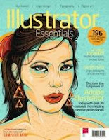
Illustrator Essentials Magazine

A couple of months ago I came across the Illustrator Essential Magazine which turned out to be a very rich  source of useful advice on how to get started and improve skills in Adobe Illustrator.


The magazine contains nearly 30 step-by-step tutorials and loads of tips for all levels of illustrator users. Apart from that it offers an access to 14 video lessons. 
I have been practicing with the magazine since then. It helped me to understand better some of the Illustrator features and learn new skills which helped me to speed up my work flow. 

wtorek, 10 grudnia 2013

Packaging Design- developing an initial idea.


My next step of designing the packaging for the Box company was developing my chosen initial idea. I started from looking for some inspiration on the INTERNET. I aimed to design a straightforward and down-to-earth box. I wanted my design to be catchy and witty. 
I was looking for some funny and catchy phrases about men`s underwear, and I came across some jokes on the INTERNET. 
This is one example:

Under Where? You: Hey, what are you doing under there? Your helpless victim: …under where? You: YOU SAID UNDERWEAR!


wtorek, 3 grudnia 2013

Packaging Design- initial ideas


Today I started drawing my initial ideas for the packaging brief. I was experimenting with different sorts of shapes of packaging to find one that is going to suit the brief best.
Eventually I decided to go for a simple, traditional box shape that opens up from a top. My idea is to decorate the box with a bold design. Keeping the form of the box simple will allow me to build a good balance between the construction of the packaging and the design on the box.